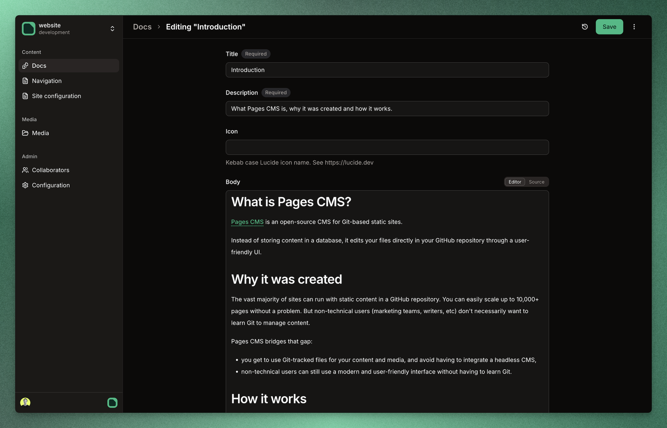
The simplest CMS you'll ever need
Manage content and media right in your GitHub repository. No database, no API, no extra backend.

Manage content and media right in your GitHub repository. No database, no API, no extra backend.

Customize content types, views, search, and more.
Rich-text, syntax highlighting, and more.
Drag and drop upload, multi-file selection, and more.
Fast, full-text and faceted search across your content.
Manage any website or app hosted on GitHub directly.
Full responsive design, optimized for mobile.
Invite users via email, no other account needed.
Connect with AWS S3, Cloudflare R2, and more.
Easily schedule one-off or recurring content updates.
Granular access control for different content types.
Integrate with GA, Cloudflare Analytics, and more.
Let your team leave inline comments on any part of your content.
Yes, Pages CMS is 100% free, whether you want to use the online version, deploy it for free on Vercel, or self-host it. It's MIT licensed through and through, feel free to extend it as you see fit.
Yes. Supposedly, we could add GitLab and Bitbucket support, but the assumption is the vast majority of users will be on GitHub. Pull requests and issues are welcome: github.com/pages-cms/pages-cms.
I hear you, but I needed Pages CMS to exist. I love static site generators, and while YAML front matter and Markdown aren't terribly complicated, editing content and uploading images using GitHub.com or Git isn't really user-friendly, especially if you're updating the site with a whole team. For that reason, a lot of teams use a headless CMS like Contentful, Sanity, or Strapi. That works, but it's one more dependency and is overkill in most cases. You could also use something like Decap CMS (formerly Netlify CMS). Really cool project, but I've never been a fan of the user experience. And most importantly, I wanted something as simple as possible. Back in 2018, I had built a lightweight CMS (Jekyll+) with the idea of getting the CMS set up with a single configuration file. Pages CMS is the next iteration of that idea.
My name is Ronan Berder (@hunvreus). I live in Singapore. I went back to writing software after years of building (and ultimately selling) a consultancy in China.
First, make sure to check the documentation. You can also ask for help in the Discord channel. Otherwise, post your issue on GitHub.